button elementautofocusdisabledformformactionformenctypeformmethodformnovalidateformtargetnametypevalueinterface HTMLButtonElement : HTMLElement {
attribute boolean autofocus;
attribute boolean disabled;
readonly attribute HTMLFormElement? form;
attribute DOMString formAction;
attribute DOMString formEnctype;
attribute DOMString formMethod;
attribute boolean formNoValidate;
attribute DOMString formTarget;
attribute DOMString name;
attribute DOMString type;
attribute DOMString value;
readonly attribute boolean willValidate;
readonly attribute ValidityState validity;
readonly attribute DOMString validationMessage;
boolean checkValidity();
void setCustomValidity(DOMString error);
readonly attribute NodeList labels;
};
The button element represents a button.
The element is a button.
The type
attribute controls the behavior of the button when it is activated.
It is an enumerated attribute. The following table
lists the keywords and states for the attribute — the keywords
in the left column map to the states in the cell in the second
column on the same row as the keyword.
| Keyword | State | Brief description |
|---|---|---|
submit
| Submit Button | Submits the form. |
reset
| Reset Button | Resets the form. |
button
| Button | Does nothing. |
The missing value default is the Submit Button state.
If the type attribute is in
the Submit Button
state, the element is specifically a submit button.
Constraint validation: If the type attribute is in the Reset Button state or
the Button state,
the element is barred from constraint validation.
When a button element is not disabled, its activation
behavior element is to run the steps defined in the following
list for the current state of the element's type attribute:
If the element has a form owner, the element
must submit the form
owner from the button element.
If the element has a form owner, the element must reset the form owner.
Do nothing.
The form attribute is used to
explicitly associate the button element with its
form owner. The name
attribute represents the element's name. The disabled attribute is used to make
the control non-interactive and to prevent its value from being
submitted. The autofocus
attribute controls focus. The formaction, formenctype, formmethod, formnovalidate, and formtarget attributes are
attributes for form submission.
The formnovalidate attribute can
be used to make submit buttons that do not trigger the constraint
validation.
The formaction, formenctype, formmethod, formnovalidate, and formtarget must not be specified
if the element's type
attribute is not in the Submit Button
state.
The value
attribute gives the element's value for the purposes of form
submission. The element's value is the value of the element's
value attribute, if there is
one, or the empty string otherwise.
A button (and its value) is only included in the form submission if the button itself was used to initiate the form submission.
The value IDL
attribute must reflect the content attribute of the
same name.
The type IDL
attribute must reflect the content attribute of the
same name, limited to only known values.
The willValidate, validity, and validationMessage
attributes, and the checkValidity() and setCustomValidity()
methods, are part of the constraint validation API. The
labels attribute provides a list
of the element's labels. The autofocus, disabled, form, and name IDL attributes are part of the
element's forms API.
The following button is labeled "Show hint" and pops up a dialog box when activated:
<button type=button
        onclick="alert('This 15-20 minute piece was composed by George Gershwin.')">
 Show hint
</button>
select elementoption or optgroup elements.autofocusdisabledformmultiplenamerequiredsizeinterface HTMLSelectElement : HTMLElement {
attribute boolean autofocus;
attribute boolean disabled;
readonly attribute HTMLFormElement? form;
attribute boolean multiple;
attribute DOMString name;
attribute boolean required;
attribute unsigned long size;
readonly attribute DOMString type;
readonly attribute HTMLOptionsCollection options;
attribute unsigned long length;
getter Element item(unsigned long index);
object namedItem(DOMString name);
void add((HTMLOptionElement or HTMLOptGroupElement) element, optional (HTMLElement or long)? before = null);
void remove(long index);
setter creator void (unsigned long index, HTMLOptionElement option);
readonly attribute HTMLCollection selectedOptions;
attribute long selectedIndex;
attribute DOMString value;
readonly attribute boolean willValidate;
readonly attribute ValidityState validity;
readonly attribute DOMString validationMessage;
boolean checkValidity();
void setCustomValidity(DOMString error);
readonly attribute NodeList labels;
};
The select element represents a control for
selecting amongst a set of options.
The multiple
attribute is a boolean attribute. If the attribute is
present, then the select element
represents a control for selecting zero or more options
from the list of
options. If the attribute is absent, then the
select element represents a control for
selecting a single option from the list of options.
The size
attribute gives the number of options to show to the user. The size attribute, if specified, must
have a value that is a valid non-negative integer
greater than zero.
The display size of a
select element is the result of applying the
rules for parsing non-negative integers to the value of
element's size attribute, if
it has one and parsing it is successful. If applying those rules to
the attribute's value is not successful, or if the size attribute is absent, then the
element's display size is 4
if the element's multiple
content attribute is present, and 1 otherwise.
The list of options
for a select element consists of all the
option element children of the select
element, and all the option element children of all the
optgroup element children of the select
element, in tree order.
The required
attribute is a boolean attribute. When specified, the
user will be required to select a value before submitting the
form.
If a select element has a required attribute specified,
does not have a multiple
attribute specified, and has a display size of 1;
and if the value of the
first option element in the select
element's list of
options (if any) is the empty string, and that
option element's parent node is the select
element (and not an optgroup element), then that
option is the select element's
placeholder label option.
If a select element has a required attribute specified,
does not have a multiple
attribute specified, and has a display size of 1,
then the select element must have a placeholder
label option.
Constraint validation: If the element has its
required attribute
specified, and either none of the option elements in
the select element's list of options have their
selectedness set to
true, or the only option element in the
select element's list of options with its
selectedness set to
true is the placeholder label option, then the element
is suffering from being missing.
If the multiple
attribute is absent, and the element is not disabled, then the user agent
should allow the user to pick an option element in its
list of options that
is itself not disabled.
Upon this option element being picked (either through a click, or
through unfocusing the element after changing its value, or through
a menu command, or through any
other mechanism), and before the relevant user interaction event
is queued (e.g. before the
click event), the user agent must
set the selectedness of the
picked option element to true and then queue a
task to fire a simple event that bubbles named
change at the select
element, using the user interaction task source as the
task source.
If the multiple
attribute is absent, whenever an option element in the
select element's list of options has its
selectedness set to
true, and whenever an option element with its selectedness set to true
is added to the select element's list of options, the user
agent must set the selectedness of all the
other option element in its list of options to
false.
If the multiple
attribute is absent and the element's display size is greater than 1,
then the user agent should also allow the user to request that the
option whose selectedness is true, if
any, be unselected. Upon this request being conveyed to the user
agent, and before the relevant user interaction event is queued (e.g. before the click event), the user agent must set the
selectedness of
that option element to false and then queue a
task to fire a simple event that bubbles named
change at the select
element, using the user interaction task source as the
task source.
If the multiple
attribute is absent and the element's display size is 1, then whenever
there are no option elements in the select
element's list of
options that have their selectedness set to true,
the user agent must set the selectedness of the first
option element in the list of options in
tree order that is not disabled, if any, to
true.
If the multiple
attribute is present, and the element is not disabled, then the user agent
should allow the user to toggle the selectedness of the
option elements in its list of options that are
themselves not disabled
(either through a click, or through a menu command, or any other mechanism).
Upon the selectedness of one or
more option elements being changed by the user, and
before the relevant user interaction event is queued (e.g. before a related click event), the user agent must
queue a task to fire a simple event that
bubbles named change at the
select element, using the user interaction task
source as the task source.
The reset
algorithm for select elements is to go through
all the option elements in the element's list of options, and set
their selectedness
to true if the option element has a selected attribute, and false
otherwise.
The form attribute is used to
explicitly associate the select element with its
form owner. The name
attribute represents the element's name. The disabled attribute is used to make
the control non-interactive and to prevent its value from being
submitted. The autofocus
attribute controls focus.
typeReturns "select-multiple" if the element
has a multiple
attribute, and "select-one"
otherwise.
optionsReturns an HTMLOptionsCollection of the list of options.
length [ = value ]Returns the number of elements in the list of options.
When set to a smaller number, truncates the number of option elements in the select.
When set to a greater number, adds new blank option elements to the select.
item(index)Returns the item with index index from the list of options. The items are sorted in tree order.
namedItem(name)Returns the item with ID or name name from the list of options.
If there are multiple matching items, then a NodeList object containing all those elements is returned.
Returns null if no element with that ID could be found.
add(element [, before ])Inserts element before the node given by before.
The before argument can be a number, in which case element is inserted before the item with that number, or an element from the list of options, in which case element is inserted before that element.
If before is omitted, null, or a number out of range, then element will be added at the end of the list.
This method will throw a HierarchyRequestError
exception if element is an ancestor of the
element into which it is to be inserted.
selectedOptionsReturns an HTMLCollection of the list of options that are
selected.
selectedIndex [ = value ]Returns the index of the first selected item, if any, or −1 if there is no selected item.
Can be set, to change the selection.
value [ = value ]Returns the value of the first selected item, if any, or the empty string if there is no selected item.
Can be set, to change the selection.
The type IDL
attribute, on getting, must return the string "select-one" if the multiple attribute is absent,
and the string "select-multiple" if the multiple attribute is
present.
The options
IDL attribute must return an HTMLOptionsCollection
rooted at the select node, whose filter matches the
elements in the list of
options.
The options collection is
also mirrored on the HTMLSelectElement object. The
supported property indices at any instant are the
indices supported by the object returned by the options attribute at that
instant.
The length IDL
attribute must return the number of nodes represented by the options collection. On setting, it
must act like the attribute of the same name on the options collection.
The item(index) method must return the value
returned by the method of the same name on the options collection, when invoked
with the same argument.
The namedItem(name) method must return the value
returned by the method of the same name on the options collection, when invoked
with the same argument.
When the user agent is to set the value of a new indexed
property for a given property index index
to a new value value, it must instead set the value of a new
indexed property with the given property index index to the new value value on the
options collection.
Similarly, the add() and remove() methods must
act like their namesake methods on that same options collection.
The selectedOptions
IDL attribute must return an HTMLCollection rooted at
the select node, whose filter matches the elements in
the list of options
that have their selectedness set to
true.
The selectedIndex
IDL attribute, on getting, must return the index of the first
option element in the list of options in
tree order that has its selectedness set to true,
if any. If there isn't one, then it must return −1.
On setting, the selectedIndex attribute must
set the selectedness of all the
option elements in the list of options to false,
and then the option element in the list of options whose
index is the given new
value, if any, must have its selectedness set to
true.
The value IDL
attribute, on getting, must return the value of the first
option element in the list of options in
tree order that has its selectedness set to true,
if any. If there isn't one, then it must return the empty
string.
On setting, the value
attribute must set the selectedness of all the
option elements in the list of options to false,
and then the first option element in the list of options, in
tree order, whose value is equal to the given new
value, if any, must have its selectedness set to
true.
The multiple,
required, and
size IDL attributes
must reflect the respective content attributes of the
same name. The size IDL
attribute has a default value of zero.
For historical reasons, the default value of the
size IDL attribute does not
return the actual size used, which, in the absence of the size content attribute, is either 1
or 4 depending on the presence of the multiple attribute.
The willValidate, validity, and validationMessage
attributes, and the checkValidity() and setCustomValidity()
methods, are part of the constraint validation API. The
labels attribute provides a list
of the element's labels. The autofocus, disabled, form, and name IDL attributes are part of the
element's forms API.
The following example shows how a select element
can be used to offer the user with a set of options from which the
user can select a single option. The default option is
preselected.
<p>
 <label for="unittype">Select unit type:</label>
 <select id="unittype" name="unittype">
  <option value="1"> Miner </option>
  <option value="2"> Puffer </option>
  <option value="3" selected> Snipey </option>
  <option value="4"> Max </option>
  <option value="5"> Firebot </option>
 </select>
</p>
When there is no default option, a placeholder can be used instead:
<select name="unittype" required>
 <option value=""> Select unit type </option>
 <option value="1"> Miner </option>
 <option value="2"> Puffer </option>
 <option value="3"> Snipey </option>
 <option value="4"> Max </option>
 <option value="5"> Firebot </option>
</select>
Here, the user is offered a set of options from which he can select any number. By default, all five options are selected.
<p>
 <label for="allowedunits">Select unit types to enable on this map:</label>
 <select id="allowedunits" name="allowedunits" multiple>
  <option value="1" selected> Miner </option>
  <option value="2" selected> Puffer </option>
  <option value="3" selected> Snipey </option>
  <option value="4" selected> Max </option>
  <option value="5" selected> Firebot </option>
 </select>
</p>
Sometimes, a user has to select one or more items. This example shows such an interface.
<p>Select the songs from that you would like on your Act II Mix Tape:</p>
<select multiple required name="act2">
 <option value="s1">It Sucks to Be Me (Reprise)
 <option value="s2">There is Life Outside Your Apartment
 <option value="s3">The More You Ruv Someone
 <option value="s4">Schadenfreude
 <option value="s5">I Wish I Could Go Back to College
 <option value="s6">The Money Song
 <option value="s7">School for Monsters
 <option value="s8">The Money Song (Reprise)
 <option value="s9">There's a Fine, Fine Line (Reprise)
 <option value="s10">What Do You Do With a B.A. in English? (Reprise)
 <option value="s11">For Now
</select>
datalist elementoption elements.interface HTMLDataListElement : HTMLElement {
readonly attribute HTMLCollection options;
};
The datalist element represents a set of
option elements that represent predefined options for
other controls. The contents of the element represents fallback
content for legacy user agents, intermixed with option
elements that represent the predefined options. In the rendering,
the datalist element represents
nothing and it, along with its children, should
be hidden.
The datalist element is hooked up to an
input element using the list attribute on the
input element.
Each option element that is a descendant of the
datalist element, that is not disabled, and whose value is a string that isn't the
empty string, represents a suggestion. Each suggestion has a value and a label.
optionsReturns an HTMLCollection of the options elements of the table.
The options
IDL attribute must return an HTMLCollection rooted at
the datalist node, whose filter matches
option elements.
Constraint validation: If an element has a
datalist element ancestor, it is barred from
constraint validation.
optgroup elementselect element.option elements.disabledlabelinterface HTMLOptGroupElement : HTMLElement {
attribute boolean disabled;
attribute DOMString label;
};
The optgroup element represents a group of
option elements with a common label.
The element's group of option elements consists of
the option elements that are children of the
optgroup element.
When showing option elements in select
elements, user agents should show the option elements
of such groups as being related to each other and separate from
other option elements.
The disabled attribute
is a boolean attribute and can be used to disable a group of
option elements together.
The label
attribute must be specified. Its value gives the name of the group,
for the purposes of the user interface. User
agents should use this attribute's value when labelling the group of
option elements in a select
element.
The disabled and label attributes must
reflect the respective content attributes of the same
name.
The following snippet shows how a set of lessons from three
courses could be offered in a select drop-down
widget:
<form action="courseselector.dll" method="get">
 <p>Which course would you like to watch today?
 <p><label>Course:
  <select name="c">
   <optgroup label="8.01 Physics I: Classical Mechanics">
    <option value="8.01.1">Lecture 01: Powers of Ten
    <option value="8.01.2">Lecture 02: 1D Kinematics
    <option value="8.01.3">Lecture 03: Vectors
   <optgroup label="8.02 Electricity and Magnestism">
    <option value="8.02.1">Lecture 01: What holds our world together?
    <option value="8.02.2">Lecture 02: Electric Field
    <option value="8.02.3">Lecture 03: Electric Flux
   <optgroup label="8.03 Physics III: Vibrations and Waves">
    <option value="8.03.1">Lecture 01: Periodic Phenomenon
    <option value="8.03.2">Lecture 02: Beats
    <option value="8.03.3">Lecture 03: Forced Oscillations with Damping
  </select>
 </label>
 <p><input type=submit value="▶ Play">
</form>
option elementselect element.datalist element.optgroup element.disabledlabelselectedvalue[NamedConstructor=Option(),
NamedConstructor=Option(DOMString text),
NamedConstructor=Option(DOMString text, DOMString value),
NamedConstructor=Option(DOMString text, DOMString value, boolean defaultSelected),
NamedConstructor=Option(DOMString text, DOMString value, boolean defaultSelected, boolean selected)]
interface HTMLOptionElement : HTMLElement {
attribute boolean disabled;
readonly attribute HTMLFormElement? form;
attribute DOMString label;
attribute boolean defaultSelected;
attribute boolean selected;
attribute DOMString value;
attribute DOMString text;
readonly attribute long index;
};
The option element represents an option
in a select element or as part of a list of suggestions
in a datalist element.
In certain circumstances described in the definition of the
select element, an option element can be a
select element's placeholder label option.
A placeholder label option does not represent an actual
option, but instead represents a label for the select
control.
The disabled
attribute is a boolean attribute. An
option element is disabled if its disabled attribute is present or
if it is a child of an optgroup element whose disabled attribute is
present.
An option element that is disabled must prevent any click events that are queued on the user interaction task
source from being dispatched on the element.
The label
attribute provides a label for element. The label of an option
element is the value of the label content attribute, if there
is one, or, if there is not, the value of the element's text IDL attribute.
The value
attribute provides a value for element. The value of an option
element is the value of the value content attribute, if there
is one, or, if there is not, the value of the element's text IDL attribute.
The selected
attribute is a boolean attribute. It represents the
default selectedness of the
element.
The selectedness
of an option element is a boolean state, initially
false. Except where otherwise
specified, when the element is created, its selectedness must be set
to true if the element has a selected attribute. Whenever an
option element's selected attribute is added, its
selectedness must
be set to true.
The Option()
constructor with three or fewer arguments overrides the initial
state of the selectedness state to
always be false even if the third argument is true (implying that a
selected attribute is to
be set). The fourth argument can be used to explicitly set the
initial selectedness state when
using the constructor.
A select element whose multiple attribute is not
specified must not have more than one descendant option
element with its selected
attribute set.
An option element's index is the number of
option element that are in the same list of options but that
come before it in tree order. If the
option element is not in a list of options, then the
option element's index is zero.
selectedReturns true if the element is selected, and false otherwise.
Can be set, to override the current state of the element.
indexReturns the index of the element in its select
element's options
list.
formReturns the element's form element, if any, or
null otherwise.
textSame as textContent, except that spaces are collapsed.
Option( [ text [, value [, defaultSelected [, selected ] ] ] ] )Returns a new option element.
The text argument sets the contents of the element.
The value argument sets the value attribute.
The defaultSelected argument sets the selected attribute.
The selected argument sets whether or not the element is selected. If it is omitted, even if the defaultSelected argument is true, the element is not selected.
The disabled
IDL attribute must reflect the content attribute of the
same name. The defaultSelected
IDL attribute must reflect the selected content attribute.
The label IDL
attribute, on getting, must return the element's label. On setting, the element's
label content attribute must
be set to the new value.
The value IDL
attribute, on getting, must return the element's value. On setting, the element's
value content attribute must
be set to the new value.
The selected
IDL attribute, on getting, must return true if the element's selectedness is true, and
false otherwise. On setting, it must set the element's selectedness to the new
value.
The index IDL
attribute must return the element's index.
The text IDL
attribute, on getting, must return the value of the
textContent IDL attribute on the element, with leading and trailing
whitespace stripped, and with any sequences of two or more
space characters replaced by a
single U+0020 SPACE character. On setting, it must act as if the
textContent IDL attribute on the element had been set
to the new value.
The form IDL
attribute's behavior depends on whether the option
element is in a select element or not. If the
option has a select element as its parent,
or has an optgroup element as its parent and that
optgroup element has a select element as
its parent, then the form IDL
attribute must return the same value as the form IDL attribute on that
select element. Otherwise, it must return null.
Several constructors are provided for creating
HTMLOptionElement objects (in addition to the factory
methods from DOM Core such as createElement()): Option(), Option(text), Option(text, value), Option(text, value, defaultSelected), and Option(text, value, defaultSelected, selected). When invoked as constructors,
these must return a new HTMLOptionElement object (a new
option element). If the text
argument is present, the new object must have as its only child a
Text node whose data is the value of that argument. If
the value argument is present, the new object
must have a value attribute
set with the value of the argument as its value. If the defaultSelected argument is present and true, the new
object must have a selected attribute set with no
value. If the selected argument is present and
true, the new object must have its selectedness set to true;
otherwise the fourth argument is absent or false, and the selectedness must be set
to false, even if the defaultSelected argument
is present and true. The element's document must be the active
document of the browsing context of the
Window object on which the interface object of the
invoked constructor is found.
textarea elementautofocuscolsdirnamedisabledformmaxlengthnameplaceholderreadonlyrequiredrowswrapinterface HTMLTextAreaElement : HTMLElement {
attribute boolean autofocus;
attribute unsigned long cols;
attribute DOMString dirName;
attribute boolean disabled;
readonly attribute HTMLFormElement? form;
attribute long maxLength;
attribute DOMString name;
attribute DOMString placeholder;
attribute boolean readOnly;
attribute boolean required;
attribute unsigned long rows;
attribute DOMString wrap;
readonly attribute DOMString type;
attribute DOMString defaultValue;
attribute DOMString value;
readonly attribute unsigned long textLength;
readonly attribute boolean willValidate;
readonly attribute ValidityState validity;
readonly attribute DOMString validationMessage;
boolean checkValidity();
void setCustomValidity(DOMString error);
readonly attribute NodeList labels;
void select();
attribute unsigned long selectionStart;
attribute unsigned long selectionEnd;
attribute DOMString selectionDirection;
void setSelectionRange(unsigned long start, unsigned long end, optional DOMString direction);
};
The textarea element represents a
multiline plain text edit control for the
element's raw
value. The contents of the control represent the
control's default value.
The raw value of
a textarea control must be initially the empty
string.
A newline in a textarea element, and in its raw value, should separate
paragraphs for the purposes of the Unicode bidirectional algorithm.
This requirement may be implemented indirectly through the style
layer. For example, an HTML+CSS user agent could implement these
requirements by implementing the CSS 'unicode-bidi' property. [BIDI] [CSS]
The readonly attribute
is a boolean attribute used to control whether the text
can be edited by the user or not.
Constraint validation: If the readonly attribute is
specified on a textarea element, the element is
barred from constraint validation.
A textarea element is mutable if it is neither
disabled nor has a readonly attribute
specified.
When a textarea is mutable, its raw value should be
editable by the user: the user agent should allow the user to edit,
insert, and remove text, and to insert and remove line breaks in the
form of U+000A LINE FEED (LF) characters. Any time the user causes
the element's raw
value to change, the user agent must queue a
task to fire a simple event that bubbles named
input at the textarea
element. User agents may wait for a suitable break in the user's
interaction before queuing the task; for example, a user agent could
wait for the user to have not hit a key for 100ms, so as to only
fire the event when the user pauses, instead of continuously for
each keystroke.
A textarea element has a dirty value flag, which must be
initially set to false, and must be set to true whenever the user
interacts with the control in a way that changes the raw value.
When the textarea element's textContent
IDL attribute changes value, if the element's dirty value flag is false,
then the element's raw
value must be set to the value of the element's
textContent IDL attribute.
The reset
algorithm for textarea elements is to set the
element's value to
the value of the element's textContent IDL
attribute.
If the element is mutable, the user agent should allow the user to change the writing direction of the element, setting it either to a left-to-right writing direction or a right-to-left writing direction. If the user does so, the user agent must then run the following steps:
Set the element's dir
attribute to "ltr" if the user
selected a left-to-right writing direction, and "rtl" if the user selected a
right-to-left writing direction.
Queue a task to fire a simple
event that bubbles named input at the textarea
element.
The cols
attribute specifies the expected maximum number of characters per
line. If the cols attribute
is specified, its value must be a valid non-negative
integer greater than zero. If applying the
rules for parsing non-negative integers to the
attribute's value results in a number greater than zero, then the
element's character
width is that value; otherwise, it is 20.
The user agent may use the textarea element's character width as a hint to
the user as to how many characters the server prefers per line
(e.g. for visual user agents by making the width of the control be
that many characters). In visual renderings, the user agent should
wrap the user's input in the rendering so that each line is no wider
than this number of characters.
The rows
attribute specifies the number of lines to show. If the rows attribute is specified, its
value must be a valid non-negative integer greater than
zero. If applying the rules for parsing
non-negative integers to the attribute's value results in a
number greater than zero, then the element's character height is that
value; otherwise, it is 2.
Visual user agents should set the height of the control to the number of lines given by character height.
The wrap
attribute is an enumerated attribute with two keywords
and states: the soft keyword
which maps to the Soft state, and the
hard keyword
which maps to the Hard state. The
missing value default is the Soft state.
The Soft state
indicates that the text in the textarea is not to be
wrapped when it is submitted (though it can still be wrapped in the
rendering).
The Hard state
indicates that the text in the textarea is to have
newlines added by the user agent so that the text is wrapped when it
is submitted.
If the element's wrap
attribute is in the Hard state, the cols attribute must be
specified.
For historical reasons, the element's value is normalised in
three different ways for three different purposes. The raw value is the value as
it was originally set. It is not normalized. The API value is the value
used in the value IDL
attribute. It is normalized so that line breaks use U+000A LINE FEED
(LF) characters. Finally, there is the form submission value. It is normalized so that line
breaks use U+000D CARRIAGE RETURN U+000A LINE FEED (CRLF) character
pairs, and in addition, if necessary given the element's wrap attribute, additional line
breaks are inserted to wrap the text at the given width.
The element's API value is defined to be the element's raw value with the following transformation applied:
Replace every U+000D CARRIAGE RETURN U+000A LINE FEED (CRLF) character pair from the raw value with a single U+000A LINE FEED (CRLF) character.
Replace every remaining U+000D CARRIAGE RETURN character from the raw value with a single U+000A LINE FEED (CRLF) character.
The element's value is defined to be the element's raw value with the following transformation applied:
Replace every occurrence of a U+000D CARRIAGE RETURN (CR) character not followed by a U+000A LINE FEED (LF) character, and every occurrence of a U+000A LINE FEED (LF) character not preceded by a U+000D CARRIAGE RETURN (CR) character, by a two-character string consisting of a U+000D CARRIAGE RETURN U+000A LINE FEED (CRLF) character pair.
If the element's wrap attribute is in the Hard state, insert
U+000D CARRIAGE RETURN U+000A LINE FEED (CRLF) character pairs
into the string using a UA-defined algorithm so that each line has
no more than character
width characters. For the purposes of this requirement,
lines are delimited by the start of the string, the end of the
string, and U+000D CARRIAGE RETURN U+000A LINE FEED (CRLF)
character pairs.
The maxlength
attribute is a form control maxlength attribute controlled by the
textarea element's dirty value flag.
If the textarea element has a maximum allowed
value length, then the element's children must be such that
the code-point length of the value of the element's
textContent IDL attribute is equal to or less than the
element's maximum allowed value length.
The required attribute
is a boolean attribute. When specified, the user will
be required to enter a value before submitting the form.
Constraint validation: If the element has its
required attribute
specified, and the element is mutable, and the element's
value is the empty string,
then the element is suffering from being missing.
The placeholder
attribute represents a hint (a word or short phrase) intended to aid
the user with data entry. A hint could be a sample value or a brief
description of the expected format. The attribute, if specified,
must have a value that contains no U+000A LINE FEED (LF) or U+000D
CARRIAGE RETURN (CR) characters.
For a longer hint or other advisory text, the title attribute is more appropriate.
The placeholder
attribute should not be used as an alternative to a
label.
User agents should present this hint to the user, after having stripped line breaks from it, when the element's value is the empty string and the control is not focused (e.g. by displaying it inside a blank unfocused control).
The dirname
attribute is a form control dirname
attribute.
The form attribute is used to
explicitly associate the textarea element with its
form owner. The name
attribute represents the element's name. The disabled attribute is used to make
the control non-interactive and to prevent its value from being
submitted. The autofocus
attribute controls focus.
typeReturns the string "textarea".
valueReturns the current value of the element.
Can be set, to change the value.
The cols, placeholder,
required, rows, and wrap attributes must
reflect the respective content attributes of the same
name. The cols and rows attributes are limited
to only non-negative numbers greater than zero. The cols attribute's default value is
20. The rows attribute's
default value is 2. The dirName IDL
attribute must reflect the dirname content attribute. The
maxLength IDL
attribute must reflect the maxlength content attribute,
limited to only non-negative numbers. The readOnly IDL
attribute must reflect the readonly content
attribute.
The type IDL
attribute must return the value "textarea".
The defaultValue
IDL attribute must act like the element's textContent
IDL attribute.
The value
attribute must, on getting, return the element's API value; on setting, it
must set the element's raw
value to the new value, set the element's dirty value flag to true, and
should then move the text entry cursor position to the end of the
text field, unselecting any selected text and resetting the
selection direction to none.
The textLength IDL
attribute must return the code-point length of the
element's API
value.
The willValidate, validity, and validationMessage
attributes, and the checkValidity() and setCustomValidity()
methods, are part of the constraint validation API. The
labels attribute provides a list
of the element's labels. The select(), selectionStart,
selectionEnd,
selectionDirection,
and setSelectionRange()
methods and attributes expose the element's text selection. The
autofocus, disabled, form, and name IDL attributes are part of the
element's forms API.
Here is an example of a textarea being used for
unrestricted free-form text input in a form:
<p>If you have any comments, please let us know: <textarea cols=80 name=comments></textarea></p>
To specify a maximum length for the comments, one can use
the maxlength
attribute:
<p>If you have any short comments, please let us know: <textarea cols=80 name=comments maxlength=200></textarea></p>
To give a default value, text can be included inside the element:
<p>If you have any comments, please let us know: <textarea cols=80 name=comments>You rock!</textarea></p>
To have the browser submit the directionality of
the element along with the value, the dirname attribute can be
specified:
<p>If you have any comments, please let us know (you may use either English or Hebrew for your comments):
<textarea cols=80 name=comments dirname=comments.dir></textarea></p>
keygen elementautofocuschallengedisabledformkeytypenameinterface HTMLKeygenElement : HTMLElement {
attribute boolean autofocus;
attribute DOMString challenge;
attribute boolean disabled;
readonly attribute HTMLFormElement? form;
attribute DOMString keytype;
attribute DOMString name;
readonly attribute DOMString type;
readonly attribute boolean willValidate;
readonly attribute ValidityState validity;
readonly attribute DOMString validationMessage;
boolean checkValidity();
void setCustomValidity(DOMString error);
readonly attribute NodeList labels;
};
The keygen element represents a key
pair generator control. When the control's form is submitted, the
private key is stored in the local keystore, and the public key is
packaged and sent to the server.
The challenge attribute
may be specified. Its value will be packaged with the submitted
key.
The keytype
attribute is an enumerated attribute. The following
table lists the keywords and states for the attribute — the
keywords in the left column map to the states listed in the cell in
the second column on the same row as the keyword. User agents are
not required to support these values, and must only recognize values
whose corresponding algorithms they support.
| Keyword | State |
|---|---|
rsa
| RSA |
The invalid value default state is the unknown state. The missing value default state is the RSA state, if it is supported, or the unknown state otherwise.
This specification does not specify what key types user agents are to support — it is possible for a user agent to not support any key types at all.
The user agent may expose a user interface for each
keygen element to allow the user to configure settings
of the element's key pair generator, e.g. the key length.
The reset
algorithm for keygen elements is to set these
various configuration settings back to their defaults.
The element's value is the string returned from the following algorithm:
Use the appropriate step from the following list:
keytype
attribute is in the RSA stateGenerate an RSA key pair using the settings given by the
user, if appropriate, using the md5WithRSAEncryption RSA signature algorithm
(the signature algorithm with MD5 and the RSA encryption
algorithm) referenced in section 2.2.1 ("RSA Signature
Algorithm") of RFC 3279, and defined in RFC 2313. [RFC3279] [RFC2313]
keytype attribute is in the unknown stateThe given key type is not supported. Return the empty string and abort this algorithm.
Let private key be the generated private key.
Let public key be the generated public key.
Let signature algorithm be the selected signature algorithm.
If the element has a challenge attribute, then let
challenge be that attribute's value.
Otherwise, let challenge be the empty
string.
Let algorithm be an ASN.1 AlgorithmIdentifier structure as defined by
RFC 5280, with the algorithm field giving the
ASN.1 OID used to identify signature
algorithm, using the OIDs defined in section 2.2 ("Signature
Algorithms") of RFC 3279, and the parameters
field set up as required by RFC 3279 for AlgorithmIdentifier structures for that
algorithm. [X690] [RFC5280] [RFC3279]
Let spki be an ASN.1 SubjectPublicKeyInfo structure as defined by
RFC 5280, with the algorithm field set to the
algorithm structure from the previous step,
and the subjectPublicKey field set to the
BIT STRING value resulting from ASN.1 DER encoding the public key. [X690] [RFC5280]
Let publicKeyAndChallenge be an ASN.1
PublicKeyAndChallenge structure as defined below,
with the spki field set to the spki structure from the previous step, and the
challenge field set to the string challenge obtained earlier. [X690]
Let signature be the BIT STRING value resulting from ASN.1 DER encoding the signature generated by applying the signature algorithm to the byte string obtained by ASN.1 DER encoding the publicKeyAndChallenge structure, using private key as the signing key. [X690]
Let signedPublicKeyAndChallenge be an ASN.1
SignedPublicKeyAndChallenge structure as defined
below, with the publicKeyAndChallenge field
set to the publicKeyAndChallenge structure,
the signatureAlgorithm field set to the algorithm structure, and the signature field set to the BIT STRING signature from the previous step. [X690]
Return the result of base64 encoding the result of ASN.1 DER encoding the signedPublicKeyAndChallenge structure. [RFC4648] [X690]
The data objects used by the above algorithm are defined as follows. These definitions use the same "ASN.1-like" syntax defined by RFC 5280. [RFC5280]
PublicKeyAndChallenge ::= SEQUENCE {
    spki SubjectPublicKeyInfo,
    challenge IA5STRING
}

SignedPublicKeyAndChallenge ::= SEQUENCE {
    publicKeyAndChallenge PublicKeyAndChallenge,
    signatureAlgorithm AlgorithmIdentifier,
    signature BIT STRING
}
Constraint validation: The keygen
element is barred from constraint validation.
The form attribute is used to
explicitly associate the keygen element with its
form owner. The name
attribute represents the element's name. The disabled attribute is used to make
the control non-interactive and to prevent its value from being
submitted. The autofocus
attribute controls focus.
typeReturns the string "keygen".
The challenge IDL
attribute must reflect the content attribute of the
same name.
The keytype
IDL attribute must reflect the content attribute of the
same name, limited to only known values.
The type IDL
attribute must return the value "keygen".
The willValidate, validity, and validationMessage
attributes, and the checkValidity() and setCustomValidity()
methods, are part of the constraint validation API. The
labels attribute provides a list
of the element's labels. The autofocus, disabled, form, and name IDL attributes are part of the
element's forms API.
This specification does not specify how the private
key generated is to be used. It is expected that after receiving the
SignedPublicKeyAndChallenge (SPKAC) structure, the
server will generate a client certificate and offer it back to the
user for download; this certificate, once downloaded and stored in
the key store along with the private key, can then be used to
authenticate to services that use TLS and certificate
authentication.
To generate a key pair, add the private key to the user's key store, and submit the public key to the server, markup such as the following can be used:
<form action="processkey.cgi" method="post" enctype="multipart/form-data">
 <p><keygen name="key"></p>
 <p><input type=submit value="Submit key..."></p>
</form>
The server will then receive a form submission with a packaged
RSA public key as the value of "key". This
can then be used for various purposes, such as generating a client
certificate, as mentioned above.
output elementforformnameinterface HTMLOutputElement : HTMLElement {
[PutForwards=value] readonly attribute DOMSettableTokenList htmlFor;
readonly attribute HTMLFormElement? form;
attribute DOMString name;
readonly attribute DOMString type;
attribute DOMString defaultValue;
attribute DOMString value;
readonly attribute boolean willValidate;
readonly attribute ValidityState validity;
readonly attribute DOMString validationMessage;
boolean checkValidity();
void setCustomValidity(DOMString error);
readonly attribute NodeList labels;
};
The output element represents the result of a
calculation.
The for content
attribute allows an explicit relationship to be made between the
result of a calculation and the elements that represent the values
that went into the calculation or that otherwise influenced the
calculation. The for attribute,
if specified, must contain a string consisting of an unordered
set of unique space-separated tokens that are
case-sensitive, each of which must have the value of an
ID of an element in the same
Document.
The form attribute is used to
explicitly associate the output element with its
form owner. The name
attribute represents the element's name.
The element has a value mode flag which is either value or default. Initially, the value mode flag must be set to default.
The element also has a default value. Initially, the default value must be the empty string.
When the value mode flag
is in mode default, the
contents of the element represent both the value of the element and
its default
value. When the value mode
flag is in mode value, the contents of the
element represent the value of the element only, and the default value is only
accessible using the defaultValue IDL
attribute.
Whenever the element's descendants are changed in any way, if the
value mode flag is in mode
default, the element's
default value must
be set to the value of the element's textContent IDL
attribute.
The reset
algorithm for output elements is to set the
element's value mode flag
to default and then to
set the element's textContent IDL attribute to the
value of the element's default value (thus
replacing the element's child nodes).
value [ = value ]Returns the element's current value.
Can be set, to change the value.
defaultValue [ = value ]Returns the element's current default value.
Can be set, to change the default value.
typeReturns the string "output".
The value IDL
attribute must act like the element's textContent IDL
attribute, except that on setting, in addition, before the child
nodes are changed, the element's value mode flag must be set to value.
The defaultValue IDL
attribute, on getting, must return the element's default value. On
setting, the attribute must set the element's default value, and, if
the element's value mode
flag is in the mode default, set the element's
textContent IDL attribute as well.
The type
attribute must return the string "output".
The htmlFor
IDL attribute must reflect the for content attribute.
The willValidate, validity, and validationMessage
attributes, and the checkValidity() and setCustomValidity()
methods, are part of the constraint validation API. The
labels attribute provides a list
of the element's labels. The form and name IDL attributes are part of the
element's forms API.
A simple calculator could use output for its
display of calculated results:
<form onsubmit="return false" oninput="o.value = a.valueAsNumber + b.valueAsNumber">
 <input name=a type=number step=any> +
 <input name=b type=number step=any> =
 <output name=o></output>
</form>
progress elementprogress element descendants.valuemaxinterface HTMLProgressElement : HTMLElement {
attribute double value;
attribute double max;
readonly attribute double position;
readonly attribute NodeList labels;
};
The progress element represents the
completion progress of a task. The progress is either indeterminate,
indicating that progress is being made but that it is not clear how
much more work remains to be done before the task is complete (e.g.
because the task is waiting for a remote host to respond), or the
progress is a number in the range zero to a maximum, giving the
fraction of work that has so far been completed.
There are two attributes that determine the current task
completion represented by the element. The value attribute
specifies how much of the task has been completed, and the max attribute specifies
how much work the task requires in total. The units are arbitrary
and not specified.
To make a determinate progress bar, add a value attribute with the current
progress (either a number from 0.0 to 1.0, or, if the max attribute is specified, a
number from 0 to the value of the max attribute). To make an
indeterminate progress bar, remove the value attribute.
Authors are encouraged to also include the current value and the maximum value inline as text inside the element, so that the progress is made available to users of legacy user agents.
Here is a snippet of a Web application that shows the progress of some automated task:
<section>
 <h2>Task Progress</h2>
 <p>Progress: <progress id="p" max=100><span>0</span>%</progress></p>
 <script>
  var progressBar = document.getElementById('p');
  function updateProgress(newValue) {
    progressBar.value = newValue;
    progressBar.getElementsByTagName('span')[0].textContent = newValue;
  }
 </script>
</section>
(The updateProgress() method in this example would
be called by some other code on the page to update the actual
progress bar as the task progressed.)
The value and max attributes, when present, must
have values that are valid
floating point numbers. The value attribute, if present, must
have a value equal to or greater than zero, and less than or equal
to the value of the max
attribute, if present, or 1.0, otherwise. The max attribute, if present, must
have a value greater than zero.
The progress element is the wrong
element to use for something that is just a gauge, as opposed to
task progress. For instance, indicating disk space usage using
progress would be inappropriate. Instead, the
meter element is available for such use cases.
User agent requirements: If the value attribute is omitted, then
the progress bar is an indeterminate progress bar. Otherwise, it is
a determinate progress bar.
If the progress bar is a determinate progress bar and the element
has a max attribute, the user
agent must parse the max
attribute's value according to the rules for parsing floating
point number values. If this does not result in an error, and
if the parsed value is greater than zero, then the maximum value of the progress
bar is that value. Otherwise, if the element has no max attribute, or if it has one but
parsing it resulted in an error, or if the parsed value was less
than or equal to zero, then the maximum value of the
progress bar is 1.0.
If the progress bar is a determinate progress bar, user agents
must parse the value
attribute's value according to the rules for parsing floating
point number values. If this does not result in an error, and
if the parsed value is less than the maximum value and greater
than zero, then the current
value of the progress bar is that parsed value. Otherwise, if
the parsed value was greater than or equal to the maximum value, then the
current value of the
progress bar is the maximum
value of the progress bar. Otherwise, if parsing the value attribute's value resulted
in an error, or a number less than or equal to zero, then the current value of the
progress bar is zero.
UA requirements for showing the progress bar:
When representing a progress element to the user, the
UA should indicate whether it is a determinate or indeterminate
progress bar, and in the former case, should indicate the relative
position of the current
value relative to the maximum value.
positionFor a determinate progress bar (one with known current and maximum values), returns the result of dividing the current value by the maximum value.
For an indeterminate progress bar, returns −1.
If the progress bar is an indeterminate progress bar, then the
position IDL
attribute must return −1. Otherwise, it must return the
result of dividing the current value by the maximum value.
If the progress bar is an indeterminate progress bar, then the
value IDL
attribute, on getting, must return 0. Otherwise, it must return the
current value. On
setting, the given value must be converted to the best
representation of the number as a floating point number and
then the value content
attribute must be set to that string.
Setting the value IDL attribute to itself when
the corresponding content attribute is absent would change the
progress bar from an indeterminate progress bar to a determinate
progress bar with no progress.
The max IDL
attribute must reflect the content attribute of the
same name, limited to numbers greater than zero. The
default value for max is
1.0.
The labels attribute provides
a list of the element's labels.
meter elementmeter element descendants.valueminmaxlowhighoptimuminterface HTMLMeterElement : HTMLElement {
attribute double value;
attribute double min;
attribute double max;
attribute double low;
attribute double high;
attribute double optimum;
readonly attribute NodeList labels;
};
The meter element represents a scalar
measurement within a known range, or a fractional value; for example
disk usage, the relevance of a query result, or the fraction of a
voting population to have selected a particular candidate.
This is also known as a gauge.
The meter element should not be used to
indicate progress (as in a progress bar). For that role, HTML
provides a separate progress element.
The meter element also does not
represent a scalar value of arbitrary range — for example, it
would be wrong to use this to report a weight, or height, unless
there is a known maximum value.
There are six attributes that determine the semantics of the gauge represented by the element.
The min attribute
specifies the lower bound of the range, and the max attribute specifies
the upper bound. The value attribute
specifies the value to have the gauge indicate as the "measured"
value.
The other three attributes can be used to segment the gauge's
range into "low", "medium", and "high" parts, and to indicate which
part of the gauge is the "optimum" part. The low attribute specifies
the range that is considered to be the "low" part, and the high attribute specifies
the range that is considered to be the "high" part. The optimum attribute
gives the position that is "optimum"; if that is higher than the
"high" value then this indicates that the higher the value, the
better; if it's lower than the "low" mark then it indicates that
lower values are better, and naturally if it is in between then it
indicates that neither high nor low values are good.
Authoring
requirements: The value attribute must be
specified. The value, min, low, high, max, and optimum attributes, when present,
must have values that are valid floating point numbers.
In addition, the attributes' values are further constrained:
Let value be the value attribute's number.
If the min attribute
attribute is specified, then let minimum be that
attribute's value; otherwise, let it be zero.
If the max attribute
attribute is specified, then let maximum be that
attribute's value; otherwise, let it be 1.0.
The following inequalities must hold, as applicable:
low ≤ maximum (if low is specified)high ≤ maximum (if high is specified)optimum ≤ maximum (if optimum is specified)low ≤ high (if both low and high are specified)If no minimum or maximum is specified, then the range is assumed to be 0..1, and the value thus has to be within that range.
Authors are encouraged to include a textual representation of the
gauge's state in the element's contents, for users of user agents
that do not support the meter element.
The following examples show three gauges that would all be three-quarters full:
Storage space usage: <meter value=6 max=8>6 blocks used (out of 8 total)</meter>
Voter turnout: <meter value=0.75><img alt="75%" src="graph75.png"></meter>
Tickets sold: <meter min="0" max="100" value="75"></meter>
The following example is incorrect use of the element, because it doesn't give a range (and since the default maximum is 1, both of the gauges would end up looking maxed out):
<p>The grapefruit pie had a radius of <meter value=12>12cm</meter>
and a height of <meter value=2>2cm</meter>.</p> <!-- BAD! -->
Instead, one would either not include the meter element, or use the meter element with a defined range to give the dimensions in context compared to other pies:
<p>The grapefruit pie had a radius of 12cm and a height of
2cm.</p>
<dl>
 <dt>Radius: <dd> <meter min=0 max=20 value=12>12cm</meter>
 <dt>Height: <dd> <meter min=0 max=10 value=2>2cm</meter>
</dl>
There is no explicit way to specify units in the
meter element, but the units may be specified in the
title attribute in free-form text.
The example above could be extended to mention the units:
<dl>
 <dt>Radius: <dd> <meter min=0 max=20 value=12 title="centimeters">12cm</meter>
 <dt>Height: <dd> <meter min=0 max=10 value=2 title="centimeters">2cm</meter>
</dl>
User agent requirements: User agents must parse
the min, max, value, low, high, and optimum attributes using the
rules for parsing floating point number values.
User agents must then use all these numbers to obtain values for six points on the gauge, as follows. (The order in which these are evaluated is important, as some of the values refer to earlier ones.)
If the min attribute is
specified and a value could be parsed out of it, then the minimum
value is that value. Otherwise, the minimum value is zero.
If the max attribute is
specified and a value could be parsed out of it, then the
candidate maximum value is that value. Otherwise, the candidate
maximum value is 1.0.
If the candidate maximum value is greater than or equal to the minimum value, then the maximum value is the candidate maximum value. Otherwise, the maximum value is the same as the minimum value.
If the value attribute is
specified and a value could be parsed out of it, then that value
is the candidate actual value. Otherwise, the candidate actual
value is zero.
If the candidate actual value is less than the minimum value, then the actual value is the minimum value.
Otherwise, if the candidate actual value is greater than the maximum value, then the actual value is the maximum value.
Otherwise, the actual value is the candidate actual value.
If the low attribute is
specified and a value could be parsed out of it, then the
candidate low boundary is that value. Otherwise, the candidate low
boundary is the same as the minimum value.
If the candidate low boundary is less than the minimum value, then the low boundary is the minimum value.
Otherwise, if the candidate low boundary is greater than the maximum value, then the low boundary is the maximum value.
Otherwise, the low boundary is the candidate low boundary.
If the high attribute is
specified and a value could be parsed out of it, then the
candidate high boundary is that value. Otherwise, the candidate
high boundary is the same as the maximum value.
If the candidate high boundary is less than the low boundary, then the high boundary is the low boundary.
Otherwise, if the candidate high boundary is greater than the maximum value, then the high boundary is the maximum value.
Otherwise, the high boundary is the candidate high boundary.
If the optimum
attribute is specified and a value could be parsed out of it, then
the candidate optimum point is that value. Otherwise, the
candidate optimum point is the midpoint between the minimum value
and the maximum value.
If the candidate optimum point is less than the minimum value, then the optimum point is the minimum value.
Otherwise, if the candidate optimum point is greater than the maximum value, then the optimum point is the maximum value.
Otherwise, the optimum point is the candidate optimum point.
All of which will result in the following inequalities all being true:
UA requirements for regions of the gauge: If the optimum point is equal to the low boundary or the high boundary, or anywhere in between them, then the region between the low and high boundaries of the gauge must be treated as the optimum region, and the low and high parts, if any, must be treated as suboptimal. Otherwise, if the optimum point is less than the low boundary, then the region between the minimum value and the low boundary must be treated as the optimum region, the region from the low boundary up to the high boundary must be treated as a suboptimal region, and the remaining region must be treated as an even less good region. Finally, if the optimum point is higher than the high boundary, then the situation is reversed; the region between the high boundary and the maximum value must be treated as the optimum region, the region from the high boundary down to the low boundary must be treated as a suboptimal region, and the remaining region must be treated as an even less good region.
UA requirements for showing the gauge: When
representing a meter element to the user, the UA should
indicate the relative position of the actual value to the minimum
and maximum values, and the relationship between the actual value
and the three regions of the gauge.
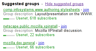
The following markup:
<h3>Suggested groups</h3>
<menu type="toolbar">
 <a href="?cmd=hsg" onclick="hideSuggestedGroups()">Hide suggested groups</a>
</menu>
<ul>
 <li>
  <p><a href="/group/comp.infosystems.www.authoring.stylesheets/view">comp.infosystems.www.authoring.stylesheets</a> -
     <a href="/group/comp.infosystems.www.authoring.stylesheets/subscribe">join</a></p>
  <p>Group description: <strong>Layout/presentation on the WWW.</strong></p>
  <p><meter value="0.5">Moderate activity,</meter> Usenet, 618 subscribers</p>
 </li>
 <li>
  <p><a href="/group/netscape.public.mozilla.xpinstall/view">netscape.public.mozilla.xpinstall</a> -
     <a href="/group/netscape.public.mozilla.xpinstall/subscribe">join</a></p>
  <p>Group description: <strong>Mozilla XPInstall discussion.</strong></p>
  <p><meter value="0.25">Low activity,</meter> Usenet, 22 subscribers</p>
 </li>
 <li>
  <p><a href="/group/mozilla.dev.general/view">mozilla.dev.general</a> -
     <a href="/group/mozilla.dev.general/subscribe">join</a></p>
  <p><meter value="0.25">Low activity,</meter> Usenet, 66 subscribers</p>
 </li>
</ul>
Might be rendered as follows:
User agents may combine the value of
the title attribute and the other
attributes to provide context-sensitive help or inline text
detailing the actual values.
For example, the following snippet:
<meter min=0 max=60 value=23.2 title=seconds></meter>
...might cause the user agent to display a gauge with a tooltip saying "Value: 23.2 out of 60." on one line and "seconds" on a second line.
The value IDL
attribute, on getting, must return the actual value. On setting, the
given value must be converted to the best representation of
the number as a floating point number and then the value content attribute must be set
to that string.
The min IDL
attribute, on getting, must return the minimum value. On setting, the
given value must be converted to the best representation of
the number as a floating point number and then the min content attribute must be set to
that string.
The max IDL
attribute, on getting, must return the maximum value. On setting, the
given value must be converted to the best representation of
the number as a floating point number and then the max content attribute must be set to
that string.
The low IDL
attribute, on getting, must return the low boundary. On setting, the given
value must be converted to the best representation of the
number as a floating point number and then the low content attribute must be set to
that string.
The high IDL
attribute, on getting, must return the high boundary. On setting, the
given value must be converted to the best representation of
the number as a floating point number and then the high content attribute must be set to
that string.
The optimum IDL
attribute, on getting, must return the optimum value. On setting, the
given value must be converted to the best representation of
the number as a floating point number and then the optimum content attribute must be
set to that string.
The labels attribute provides
a list of the element's labels.
The following example shows how a gauge could fall back to localized or pretty-printed text.
<p>Disk usage: <meter min=0 value=170261928 max=233257824>170 261 928 bytes used
out of 233 257 824 bytes available</meter></p>